1.3.6 - Identify Purpose - AAA
Intent
The purpose of user interface elements, icons, and regions can be programmatically determined.
Who Benefits
- People with cognitive disabilities (such as those related to memory, focus and attention, language, or decision making) can personalize their web experience with custom icons to better understand the content and by displaying only the parts of webpages they want to reduce distractions.
Identify Purpose
Elements on a webpage, like icons and buttons, should have a clear purpose that computers can understand. This is crucial for users who rely on symbols instead of text, as it allows them to navigate the web more effectively. Users can swap out words and icons with symbols they understand better. For example, someone might replace the label "Search" or a common magnifying glass icon with a symbol that represents search for them. This way, they can customize their web experience, making it more accessible and tailored to their specific needs and preferences. Using semantic HTML and text alternatives for user interface elements and icons is a good start.
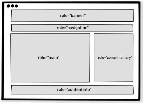
Furthermore, it is possible to use landmark regions to label various sections of a webpage, such as the main content, navigation menu, or footer. This allows users to employ assistive technologies to hide parts of the page they don't need, making things less distracting.
Currently, there are no normative recommendations or techniques on how to indicate the purpose of icons and user interface elements or how to provide additional metadata. This may be specified in the future. But you can check the WAI-Adapt: Symbols Module from W3C, guiding how to indicate purposes for icons and user interface elements, particularly for Augmentative and Alternative Communication (AAC) symbols.
Examples
Correct Usage
The following example shows the correct usage or implementation of accessibility.
Example 1: Landmarks
The webpage is organized into distinct sections using landmarks regions. For instance, the main content area is labeled as the "main" landmark, the navigation menu as the "navigation" landmark, and the footer as the "contentinfo" landmark. This organization helps users, especially those relying on assistive technologies, to navigate through the major parts of the page more efficiently. Moreover, users have the flexibility to use assistive technologies to hide specific regions of the page that they find distracting, allowing for a more focused and personalized browsing experience.
