1.4.1 - Use of Color - A
Intent
Color is not the only way to convey information.
Who Benefits
- People who cannot see colors or have difficulty differentiating colors can understand the content thanks to other visual cues or text.
- People in various environments, such as in bright sunlight or other challenging lighting conditions, do not need to rely solely on color.
- People who personalize the display settings of their devices benefit from content that does not depend on color.
Use of Color
Color is important in designing web content. It enhances the overall look, usability, and accessibility. When assigning meaning to colors, it is essential to ensure clarity for all users. To achieve this, additional visual cues like icons, shapes, patterns, or text are used to convey the same information.
This criterion does not say "do not use colors". It highlights the importance of having another way to show information besides just using colors. This ensures that more people can understand the information.
Examples
Correct Usage
The following examples show the correct usage or implementation of accessibility.
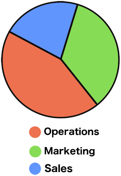
Example 1: Pie Chart
The pie chart is divided into 3 parts. Each part is colored differently and contains the label and percentage: Operations, with 45%, on a red background; Marketing, with 35%, on a green background; and Sales, with 20%, on a blue background. Color is used to visually distinguish different pieces of the pie chart, but if the color was not there, no information would be lost, thanks to the labels and numbers inside.

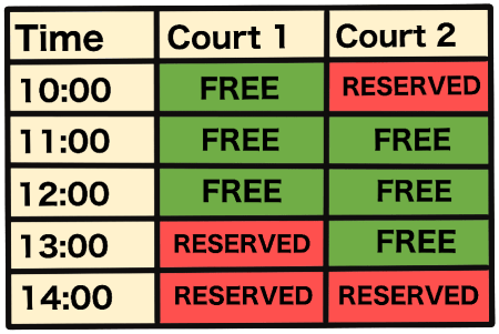
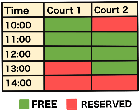
Example 2: Reservation System
The online reservation system has a table showing the availability of sports courts at different times. Table cells representing free slots have green backgrounds and text "FREE". Those that represent reserved slots have a red background and the text "RESERVED". The color helps visual users to identify court availability. Importantly, it is not the only way to tell the difference, thanks to the texts inside.
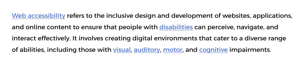
Example 3: Links
A block of text contains several underlined links. The color of the text is black, and the color of the links is light blue. The color differentiates the regular text from links with a sufficient contrast ratio. The underline style and color are sufficient for visual users to identify links in text.
Incorrect Usage
The following examples show incorrect usage or implementation of accessibility.
Example 1: Pie Chart
The pie chart is divided into 3 parts that differ only by color. Below is a legend connecting labels to colors: Red for Operations, green for Marketing, and blue for Sales. People with visual impairments or color blindness may have difficulty distinguishing between the segments represented by red, green, and blue, as they depend on a color-coded legend that is not accessible to all users.
Example 2: Reservation System
The online reservation system has a table showing the availability of sports courts at different times. Table cells differ only by color. Below is a legend connecting labels to colors: Green for Free, and red for Reserved. This mirrors the same accessibility concern as the previous example because the information depends solely on color.
Example 3: Links
A block of text contains several links. The color of the text is black, and the color of the links is dark blue. As the only means to tell the difference between regular text and links is color, which does not have a sufficient contrast ratio, people with visual impairments or color blindness may not recognize links at all.
Test Your Knowledge
If red is used to indicate important information on a webpage, is it compliant with WCAG 1.4.1 - Use of Color?
It is compliant if there is additional non-color information or context provided, ensuring that users who may not perceive the color red can still understand the importance of the information.
Is it enough to differentiate regular text from links only by the change in color if the contrast ratio between them is at least 3:1?
It is enough to meet WCAG conformance but is not a great user experience. Not relying only on color and providing more visual clues, such as underlined styles for links, would enhance the experience for many users.