1.4.6 - Contrast (Enhanced) - AAA
Intent
Text has enough contrast against its background color.
All of the points from the 1.4.3 Contrast (Minimum) - AA apply to this criterion; only the contrast ratio requirements are more strict.
Contrast Ratio
The contrast ratio is a way to measure how much one color stands out from another.
This criterion contains requirements for two types of text:
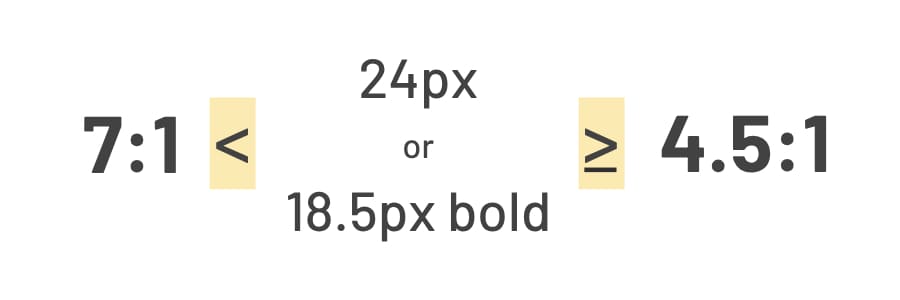
- Normal text - text that has less than 24px or 18.5px in bold needs to have a contrast ratio at least 7:1.
- Large text - text that has at least 24px or 18.5px in bold needs to have a contrast ratio at least 4.5:1.
These ratio requirements are the only difference between Contrast (Minimum) and Contrast (Enhanced) criteria. To sum it up:
- In 1.4.3 - Contrast (Minimum) - AA, the contrast needs to be at least 4.5:1 for text and 3:1 for large text.
- In 1.4.6 - Contrast (Enhanced) - AAA, the contrast needs to be at least 7:1 for text and 4.5:1 for large text.
Examples
Correct Usage
The following example shows the correct usage or implementation of accessibility.
Example 1: Sufficient Contrast
Dark, almost black text is placed over a light, almost white background color. The color contrast of these two colors is 11.44:1. It has a large contrast ratio, way beyond the minimum requirements, and is easy to read.

Incorrect Usage
The following example shows incorrect usage or implementation of accessibility.
Example 1: Insufficient Contrast
Dark red text is placed over a dark black background color. The color contrast of these two colors is 1.38:1. It has a very low contrast ratio below the minimum requirements and is hard to read.

Test Your Knowledge
Is a website compliant with WCAG 1.4.6 - Contrast (Enhanced) if it uses black text (#000) on a white background (#FFF) for its main content?
Yes, it is compliant. Using black text on a white background creates the largest possible contrast ratio.