1.4.11 - Non-text Contrast - AA
Intent
User interface components and graphics have enough contrast against surrounding colors.
Who Benefits
- People with visual impairments can see and recognize visual elements.
- Anyone can see contrasting user interface better.
Non-text Contrast
Non-text contrast is contrast of user interface components, graphical objects, and their states against the surrounding colors. To meet this criterion, you need to ensure contrast ratio of at least 3:1.
User Interface Components
User interface components, or UI components, are the elements that make up the graphical layout of an application or website, enabling interaction between the user and the software. These include buttons, text fields, checkboxes, sliders, and menus, among others, which are essential for users to navigate, input, and control the software's functions.
Users must be able to recognize the component thanks to the sufficient contrast ratio between the color of the component and the color around it. This applies for all component states, such as focus, hover, or active - adjacent colors in all these states must have enough contrast ratio.
Graphical Objects
Graphical objects are visual elements like icons, charts, and images used to represent information or concepts in a more intuitive way. They complement text by visually conveying messages or data, making it easier to understand or interact with the content.
Not every graphical object needs to contrast with its surroundings - only those that are required for users to understand what the graphic is conveying.
Exceptions
The 3:1 contrast ratio requirement does not need apply for the following:
- Inactive (disabled) components. However, if you aim for good accessibility and not just compliance, you ensure enough contrast for these too.
- When the appearance of the component is set by the user agent (browser) and not modified by author. But again, we recommend to go beyond WCAG and ensure enough contrast for these too.
- When the particular presentation of graphical objects is essential to the information being conveyed - such as logos, photographs or screenshots.
- When the information is available in another form - such as in text or inside the table.
- Pure decorational content.
Examples
Correct Usage
The following example shows the correct usage or implementation of accessibility.
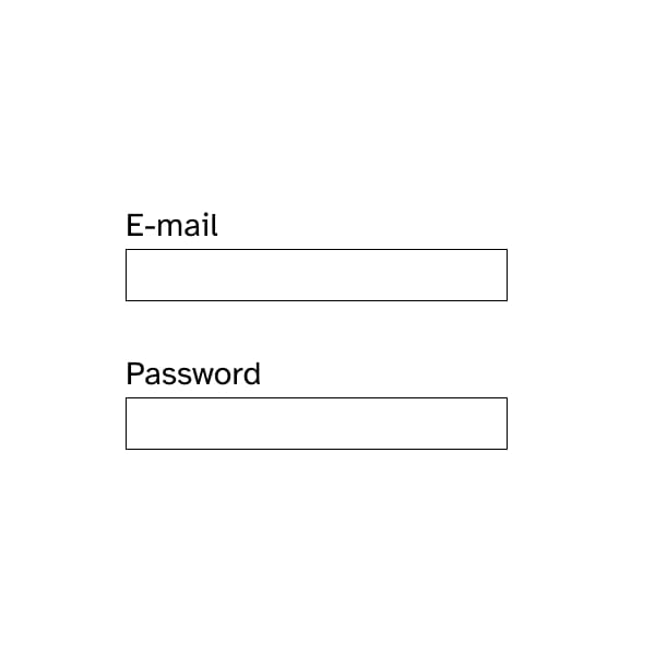
Example 1: Inputs with enough contrast
The form contains two input fields for e-mail and password. Users can recognize the inputs thanks to the black border that exceeds the minimum requirements for contrast. Users with vision impairments or users in challenging lighting conditions should be able to see it well.
Incorrect Usage
The following example shows incorrect usage or implementation of accessibility.
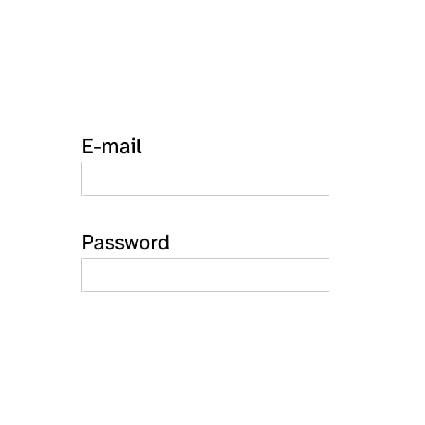
Example 1: Inputs with insufficient contrast
The form contains two input fields for e-mail and password. Users would have troubles recognize the inputs because of the light gray border that does not meet the minimum requirements for contrast. Users with vision impairments or users in challenging lighting conditions might not see the input at all, not knowing there is a form.
Test Your Knowledge
Does a decorative graphic need to meet the 3:1 contrast ratio requirements?
No, decorative content is not subject to this criterion.
Is a user interface component that is inactive and does not interact with the user required to meet the 3:1 contrast ratio?
No, inactive components are an exception to this criterion.