1.4.3 - Contrast (Minimum) - AA
Intent
Text has enough contrast against its background color.
Who Benefits
- People with low vision can better read text that does contrast with its background.
- People with colorblindness do not struggle to see text that stands out from the background.
- People in various environments, such as in bright sunlight or other challenging lighting conditions, can see the contrasting text better.
- Anyone benefits from enough color contrast as it is easier to read and less straining on the eyes.
Contrast

Color contrast is about how different two colors look next to each other, like how easily you can see yellow text on a white background versus on a dark blue one. Good contrast makes it easier to read and see things clearly.
Contrast Ratio
The contrast ratio is a way to measure how much one color stands out from another. It is like comparing how bright or dark colors are against each other. For example, black text on a white background has the highest contrast ratio (21:1) because the black is very dark and the white is very bright.
This criterion contains requirements for two types of text:
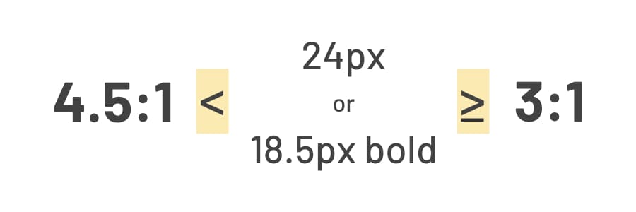
- Normal text - text that has less than 24px or 18.5px in bold needs to have a contrast ratio at least 4.5:1.
- Large text - text that has at least 24px or 18.5px in bold needs to have a contrast ratio at least 3:1.

This is also applicable for images of text where the text needs to have enough contrast against its background.
To check if your colors meet WCAG contrast criteria, try the WebAIM Contrast Checker. It is a quick tool for testing color combinations. Chrome DevTools also has a built-in contrast checker for web development, and Figma users can use the Contrast plugin. There are plenty of other tools available too, each offering different features to help ensure your website meets accessibility standards.
Exceptions
Logotypes, disabled controls, and decorative content do not need to meet any contrast requirements to meet the Contrast (Minimum) criterion. However, we still recommend designing all UI elements with enough contrast so users can clearly see them.
Examples
Correct Usage
The following example shows the correct usage or implementation of accessibility.
Example 1: Sufficient Contrast
Dark blue text is placed over a light blue background color. The color contrast of these two colors is 8.6:1. It has a large contrast ratio, way beyond the minimum requirements, and is easy to read. Sufficient color contrast illuminates clarity in design.

Incorrect Usage
The following example shows incorrect usage or implementation of accessibility.
Example 1: Poor Contrast
Light yellow text is placed over a light blue background color. The color contrast of these two colors is 1.15:1. It has a very low contrast ratio below the minimum requirements and is hard to read. Poor color contrast casts a shadow over design.

Test Your Knowledge
Is a website compliant with WCAG 1.4.3 - Contrast (Minimum) if it uses very light grey text on a white background for its main content?
No, it is not compliant. Using very light grey text on a white background creates insufficient contrast, making it difficult for users with visual impairments to read the content. WCAG 1.4.3 requires a minimum contrast ratio to ensure readability.
If a website uses text over a photo background, and the text is readable in some sections but not in others due to varying colors in the photo, does it meet WCAG 1.4.3 - Contrast (Minimum)?
No, it does not meet the criterion. WCAG 1.4.3 requires text to be legible against its background across the entire text content.